Titia Hoogendoorn
Actress, video and podcast creator and author

About Titia
I've known Titia for a while. My whole life to be precise. Growing up as sib lings, I know she's creative, outspoken and no nonsense. She never sits still and always has a lot of projects she is working on.
Problem
Back in 2017 we made her first website. It was very fun and exentric. We wanted to add something that we loved playing with growing up in the 90's. So we added a soundboard as the main feature on the homepage. This worked well with all the art and YouTube videos she made during that time.
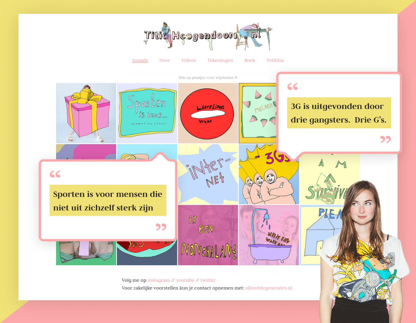
We both still liked the website, but what Titia wanted to achieve with it changed. She wanted to:
- Give a better overview of what projects she's currently doing.
- Give a general design update to the site (it looked a bit old).
- Make the site feel more professional and simple. Her target audience changed from 'fans' to 'potential clients'.
Solution
Titia liked the pastel pink we used in the old site. We kept it as a secondary color and combined it with a new harder green color that matched with her new portrait photo.
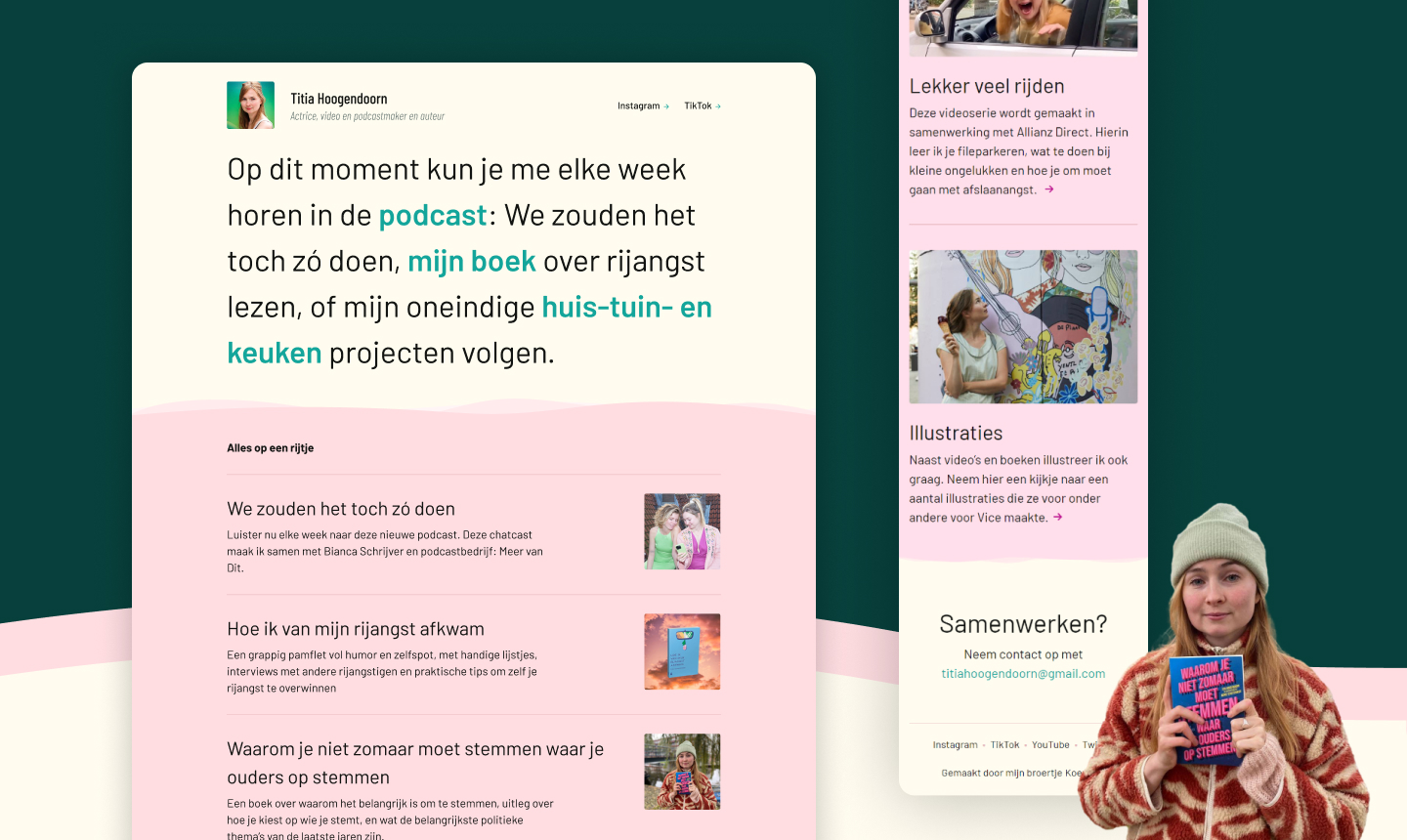
The portrait photo, name and subtitle give context to who's site this is. But it's not the main focus point. That would be Titia's main projects. By putting the large text beneath the portrait and name, it feels like she is giving you a short update on what she's currently doing. It's also easy to edit, which is nice, since she's always doing new projects.
The pink 'Alles op een rijtje' section shows off all important projects she's done to potential clients.
The contact section is just like Titia: no nonsense. Want to contact her? Here's her e-mail.
My role
I designed and developed this website.
Website
The live version of this website can be found here.